
Last updated: June 2026
This guide covers technical auditing, on-page optimization, Core Web Vitals, and structured data for mobile. It does NOT address app store SEO or AMP (Accelerated Mobile Pages), which follow separate optimization paths.
Mobile devices accounted for 62.54% of global organic search traffic in Q4 2024 (Statista). And Google has completed its mobile-first indexing rollout to 100% of websites, which means Google crawls and ranks your site based on how it looks and performs on a phone, not a desktop.
If your rankings dropped recently and your desktop experience looks fine, that’s not a coincidence. Most audits miss the actual problem.
This mobile SEO checklist walks you through every layer that affects mobile rankings: technical setup, page speed, Core Web Vitals, content structure, structured data, and link signals. Each section is organized as an actionable audit step, not a theory lesson.
What Is a Mobile SEO Checklist (And Why Most Sites Still Fail It)
A mobile SEO checklist is a structured audit framework used to verify that a website meets Google’s mobile-first indexing requirements, delivers fast load times on mobile networks, and provides a usable experience on small screens.
Here’s the thing: passing Google’s basic mobile-friendly test doesn’t mean you’re optimized. It means you’re not broken. Those are different things.
According to Google’s own research, 53% of mobile users abandon a page that takes longer than 3 seconds to load. Most “mobile-friendly” sites load in 5 to 8 seconds on a real 4G connection. The test passes. The rankings don’t.
A mobile SEO checklist is a step-by-step audit process for ensuring a website is correctly indexed, fast-loading, and usable on mobile devices according to Google’s mobile-first indexing standards. It covers technical configuration, page speed, Core Web Vitals thresholds, content formatting, and structured data validation.
Section 1: Confirm Your Mobile-First Indexing Setup
Before touching anything else, verify Google is actually crawling the right version of your site.
Check Which Version Google Is Crawling
Open Google Search Console, go to Settings, and look under “Crawling.” If you see “Mobile-first indexing: Enabled,” great, that’s expected for all sites now. What you’re really checking is whether your mobile and desktop versions serve the same content.
The most common failure here isn’t dynamic serving or a separate m-dot subdomain (though those need attention). It’s a site that loads fine on desktop but lazy-loads or hides content on mobile using CSS like display: none or visibility: hidden. Google’s mobile crawler sees the hidden version. Your rankings reflect it.
Run this quick check in Google Search Console:
- Go to URL Inspection Tool
- Enter your most important pages
- Click “Test Live URL,” then “View Crawled Page.”
- Compare the rendered HTML to your desktop version
If key content, especially headings, body copy, or product descriptions, is missing from the mobile-rendered version, that’s a direct ranking signal difference.
Verify Your Robots.txt Isn’t Blocking Googlebot-Smartphone
Look for any lines in your robots.txt that reference Googlebot-Mobile or Googlebot-Smartphone. A common migration error from older sites is a leftover disallow rule for mobile crawlers that was put in place before mobile-first indexing existed.
If robots.txt issues or indexing gaps are surfacing, a broader technical SEO audit for your site’s crawlability will uncover problems the mobile audit alone won’t catch.
For Google’s current crawling requirements and mobile-first indexing behavior, review the official Google Search Central’s mobile-first indexing documentation.
Section 2: Core Web Vitals for Mobile: The Numbers That Actually Matter
This is what most mobile SEO guides skip entirely. They mention “page speed” and point you to PageSpeed Insights. That’s not enough.
Core Web Vitals have different thresholds on mobile vs. desktop, and Google evaluates them using field data (real user measurements from Chrome users) rather than lab data alone. You can score 90 on PageSpeed Insights lab tests and still have failing field data.
Here are the current mobile thresholds you need to pass:
| Metric | Good | Needs Improvement | Poor | What It Measures |
|---|---|---|---|---|
| LCP (Largest Contentful Paint) | Under 2.5s | 2.5s — 4.0s | Over 4.0s | How fast the main content loads |
| INP (Interaction to Next Paint) | Under 200ms | 200ms — 500ms | Over 500ms | How fast the page responds to taps |
| CLS (Cumulative Layout Shift) | Under 0.1 | 0.1 — 0.25 | Over 0.25 | How much content jumps around while loading |
Quick note: INP replaced FID (First Input Delay) in March 2024. If your audit notes still reference FID, they’re outdated.
How to check your actual field data:
- Open Google Search Console and navigate to “Experience,” then “Core Web Vitals.”
- Filter by mobile, and the desktop tab shows completely separate data
- Check for pages marked “Poor” or “Needs improvement.”
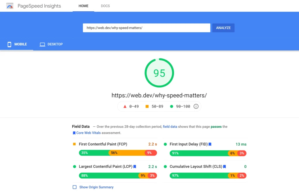
- Cross-reference those URLs in Google PageSpeed Insights under the “Discover what your real users are experiencing” section
Look, if you’re a site owner seeing a gap between your lab scores and your field data, the most common culprit is third-party scripts (chat widgets, tag managers, ad scripts) that load after the initial render but block tap interactions. That destroys INP specifically.
To check your mobile Core Web Vitals field data:
- Open Google Search Console and click “Core Web Vitals” under Experience
- Switch to the Mobile tab and identify failing URLs
- Paste each failing URL into Google PageSpeed Insights
- Scroll to “Discover what your real users are experiencing” for field data
- Compare LCP, INP, and CLS values against mobile thresholds
I’ve seen conflicting data on how heavily Google weights Core Web Vitals as a direct ranking factor. Some case studies show significant ranking improvements after CWV fixes; others show minimal change. My read is that CWV matters most as a tiebreaker between pages with similar content quality, but on competitive SERPs, tiebreakers are everything.
Section 3: Page Speed Optimization for Mobile Networks
Speed on mobile is not the same problem as speed on desktop. Desktop optimization focuses on bandwidth. Mobile optimization has to account for bandwidth, connection latency, AND CPU limitations on mid-range devices.
Most mobile users in high-growth markets like India and Pakistan aren’t on 5G. They’re on 4G connections with real-world speeds of 10-20 Mbps. Optimize for that, not for a fiber connection in a lab.
The mobile-specific speed checklist:
- Compress images to WebP or AVIF format. JPEG compression helps, but WebP delivers 25-35% smaller files at the same visual quality. AVIF goes further but has slightly lower browser support (currently ~93% globally). Use
<picture>tags to serve AVIF with WebP fallback.
While you’re optimizing image formats and sizes, it’s worth getting image file naming and alt text for SEO right at the same time Google uses both signals. - Lazy-load images below the fold. Add
loading="lazy"to<img>tags that aren’t in the initial viewport. Don’t lazy-load your LCP image; that’s a common mistake that tanks your LCP score. - Eliminate render-blocking resources. Use
deferorasyncOn non-critical JavaScript. Move non-critical CSS to load asynchronously. - Set explicit width and height on all images. This prevents CLS by reserving space before the image loads.
- Reduce server response time (TTFB). If your TTFB is over 600ms on mobile, no amount of front-end optimization will fix your LCP. Check your hosting, implement server-side caching, and consider a CDN.
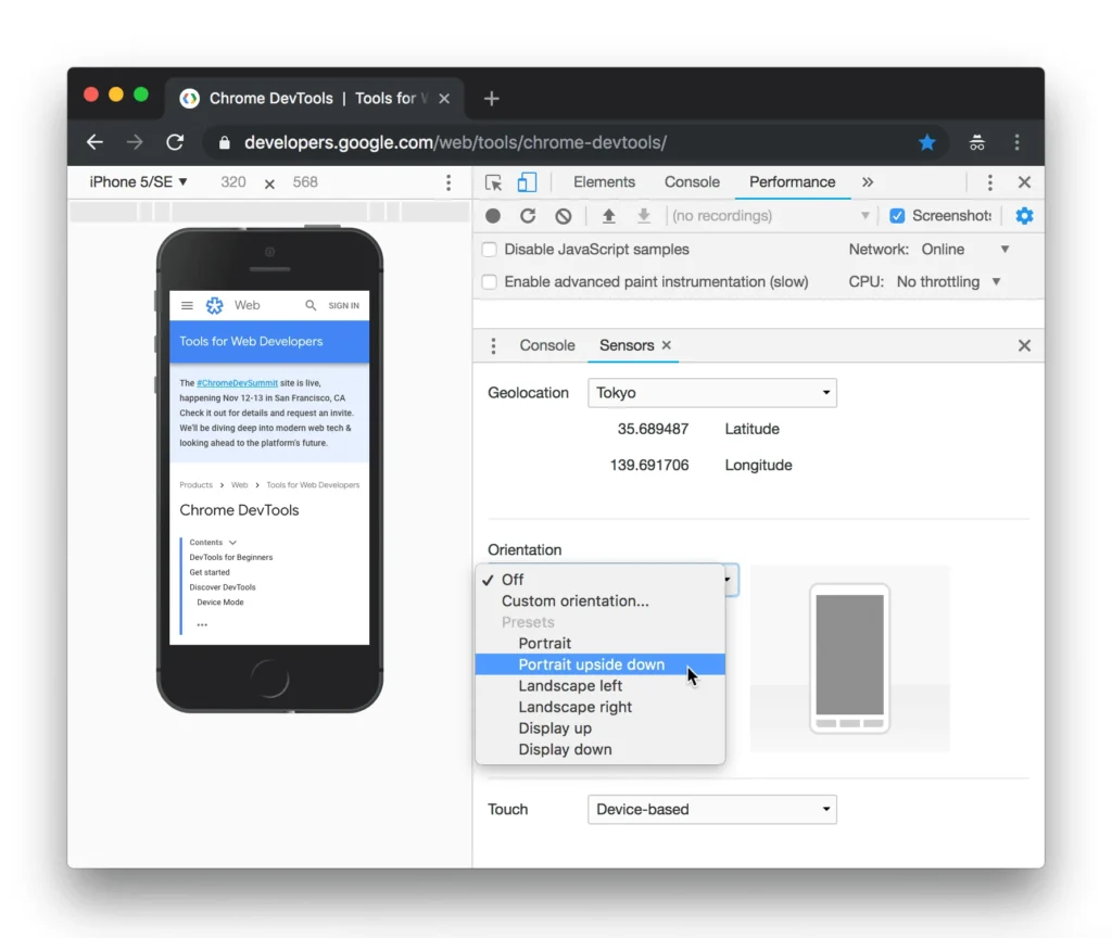
- Test on real throttled connections. In Chrome DevTools, set network throttling to “Fast 4G” and run a load test. This is far more realistic than default lab conditions.
That changes everything for sites that look fast internally but have never been tested on a real mobile network profile.
Section 4: Responsive Design and Mobile Usability Audit
Responsive design is the baseline. Google’s documentation is clear on this: responsive is the recommended configuration. Dynamic serving and separate mobile URLs (m-dot) are supported but create ongoing maintenance problems.
The Mobile Usability Audit Checklist
Run Google Search Console > Experience > Mobile Usability first. It will surface the most common issues automatically. But some problems won’t show there.
Manual checks to run on your 5 most important pages:
- Viewport meta tag: Confirm every page has
<meta name="viewport" content="width=device-width, initial-scale=1">. Missing this tag causes the page to render at desktop width on mobile. - Tap target sizing: Interactive elements (buttons, links, form fields) should be at least 48x48px with 8px of spacing between them. Use Chrome DevTools mobile emulator and try tapping your nav links with a fingertip.
- Font size legibility: Body text should be at minimum 16px on mobile. Anything under 12px will trigger a “Text too small to read” flag in Search Console.
- Horizontal scrolling: No page element should force horizontal scrolling. Check for fixed-width containers, tables, or images without
max-width: 100%. - Intrusive interstitials: Full-screen pop-ups that appear immediately on mobile page load are a confirmed Google ranking penalty for mobile searches. Age-gating and legally required notices are exempt.
- Form usability: Input fields should trigger the correct mobile keyboard type. Use
type="email"for email fields,type="tel"for phone numbers. This doesn’t affect SEO directly, but it affects bounce rate and conversion, which affect ranking signals.
Responsive design vs. separate mobile URLs (m-dot): Responsive design is better suited for most websites because it uses a single URL and requires no redirect logic, simplifying Googlebot’s crawl. Separate mobile URLs work when highly customized mobile experiences are needed, but they require careful canonical tag and rel=alternate configuration. The key difference is maintenance complexity and redirect overhead on mobile page load.
Section 5: Mobile Content Optimization
Here’s something most people miss: Google’s mobile crawler has a smaller crawl budget per page than the desktop crawler, and it renders content in a narrower viewport. That means content that relies on horizontal layout, tabs, or accordions to show information may not be fully parsed.
Or maybe I should say it this way: content that’s hidden behind a tap/click interaction on mobile is still indexed by Google, but there’s credible evidence that it may carry slightly less weight than visible content. Google has gone back and forth on this publicly. The current guidance (as of 2024) says hidden content IS indexed. But “indexed” doesn’t always mean “weighted equally.”
Mobile content checklist:
- Keep paragraphs to 3-4 lines maximum on mobile. Long blocks of text have measurably higher abandonment rates on small screens.
- Use H2 and H3 headings to break content into scannable sections. Mobile readers scroll fast.
- Put your most important information in the first two paragraphs. Don’t bury the answer.
- Ensure videos are embedded responsively. YouTube embeds with fixed pixel widths break on mobile. Use
width: 100%on the iframe wrapper. - Check that tables are scrollable horizontally or reformatted for mobile. A data table with 6 columns is unreadable on a 390px screen.
- Avoid PDF links as primary content destinations. PDFs are poorly indexed on mobile and create a bad user experience.
What most guides skip is the intersection of content structure and mobile crawl rendering. Screaming Frog SEO Spider (version 20+) lets you crawl your site using a Googlebot Smartphone user agent and compare the rendered content against your desktop crawl. That diff will show you exactly what the mobile crawler sees differently.
Section 6: Structured Data and Schema Markup for Mobile
Neither of the top-ranking competitors for this topic covers this. It’s a real gap.
Google renders and validates schema differently on mobile vs. desktop in a few specific cases. If your schema is only validated in Google’s Rich Results Test using desktop rendering, you may have mobile-specific errors you don’t know about.
The mobile schema checklist:
- Use the Rich Results Test with the mobile rendering option. There’s a toggle in the tool that lets you switch between desktop and mobile rendering. Test your most schema-heavy pages (product pages, FAQ pages, article pages, local business pages) in both modes using the Google Rich Results Test before publishing schema changes.
- Check for overlapping schema blocks. Sites that inject schema via Google Tag Manager AND via a plugin (like Yoast or Rank Math) often end up with duplicate or conflicting schema on mobile page renders because GTM injects asynchronously and the render timing differs on slower mobile connections.
- Validate FAQ schema. If your article includes Q&A sections, add FAQ schema. Google pulls FAQ rich results predominantly for mobile SERPs; they appear less frequently on desktop. This is one of the highest-ROI schema types for informational content.
- Product schema on mobile: For e-commerce, ensure price, availability, and review aggregate data are in the mobile-rendered DOM, not injected after load by JavaScript. Screaming Frog’s rendered page view will confirm this.
- Local Business schema: If you have a physical location, verify that your
@type: LocalBusinessschema is accessible in the mobile render. Local search queries have a 68% mobile share (Google, 2024), making this the most mobile-sensitive schema type. For businesses targeting local search, mobile performance intersects directly with map pack rankings; see how mobile usability issues that kill local rankings compound the problem in a local SEO context.
Some SEO professionals argue schema doesn’t directly impact rankings, only rich result eligibility. That’s valid for pure ranking discussions. But if you’re dealing with mobile search where rich results (FAQs, reviews, products) take up a significant portion of the SERP real estate, schema becomes a visibility multiplier, not just a formatting choice.
Voice Search and AEO: 5 Questions This Checklist Answers
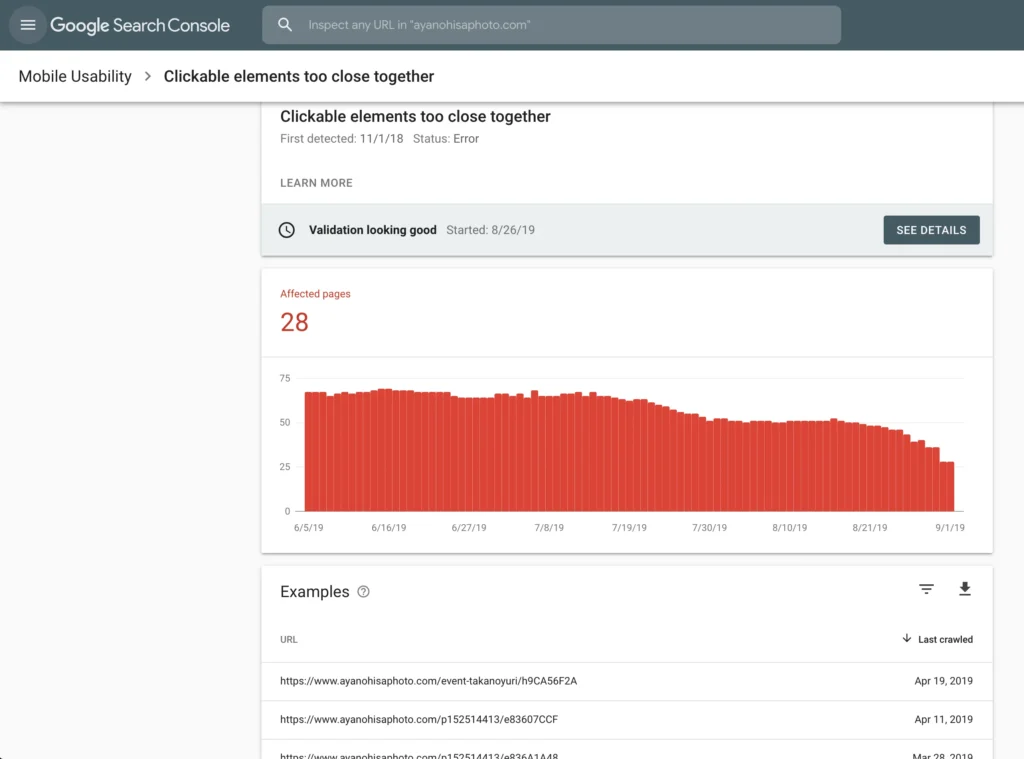
Q: What’s the best way to check if my site is mobile-friendly for SEO?
A: Use Google Search Console’s Mobile Usability report for scale and the URL Inspection Tool for page-level detail. Google PageSpeed Insights adds Core Web Vitals field data. Run all three together for a complete picture.
Q: How do I fix mobile usability errors in Google Search Console?
A: Identify the error type first. “Clickable elements too close together” means tap target sizing. “Text too small to read” means font size under 16px. “Viewport not set” means a missing meta viewport tag. Each error links to specific documentation inside Search Console.
Q: Should I use a separate mobile site or a responsive design for SEO?
A: Responsive design is almost always the right choice for new builds. Separate mobile URLs (m-dot sites) require precise rel=alternate and canonical configuration, and redirect overhead hurts mobile load time. Responsive sites are simpler to maintain and less error-prone.
Q: Why does my site rank differently on mobile vs. desktop searches?
A: Google uses mobile-first indexing, so if your mobile version has less content, slower load times, or different on-page signals than your desktop version, you’ll see ranking gaps. Core Web Vitals field data is also collected separately for mobile and desktop users.
Q: When should I prioritize INP over LCP in my mobile optimization?
A: Prioritize LCP first if your page is primarily content-driven (blogs, landing pages). Prioritize INP first if your page is interaction-heavy (filters, add-to-cart buttons, forms). Both need to pass, but the order of fixes depends on what your users do on the page.
Quick Comparison: Mobile SEO Audit Tools
| Tool | Best For | Key Benefit | Limitation |
|---|---|---|---|
| Google Search Console | Site-wide mobile error detection | Free, uses real Google crawl data | No competitive insight, slow data refresh |
| Google PageSpeed Insights | CWV field data + lab diagnostics | Shows both real-user and lab scores | Single URL at a time |
| Screaming Frog SEO Spider | Technical crawl with mobile user agent | Renders JavaScript, bulk crawl | Paid for full features, desktop tool only |
| Chrome DevTools | Real-time mobile rendering and throttling | Instant, device-specific testing | Manual, not scalable across large sites |
| Rich Results Test | Schema validation for mobile rendering | Mobile vs. desktop rendering toggle | Schema testing only, not a full SEO audit |
The One Thing to Do After This Checklist
Don’t try to fix everything at once. Prioritize in this order:
- Fix any critical Mobile Usability errors in Search Console first; these are the clearest ranking signals
- Address failing Core Web Vitals pages in field data (not just lab scores)
- Confirm your mobile-rendered content matches desktop content for your top 10 pages
- Add or validate FAQ schema using the mobile rendering mode
The biggest mistake site owners make is running PageSpeed Insights once, seeing an 80+ score, and assuming mobile is handled. Field data tells a different story for most real-world sites on shared hosting or with multiple third-party scripts loaded.
One last check: revisit this audit every time you add a new plugin, embed a third-party widget, or run a site redesign. Mobile performance degrades incrementally. Most sites don’t have one big problem. They have twelve small ones that compound.
Leave a Reply